See Films Differently Film language
Why Were Silent Films Tinted?
Blue night scenes and amber interiors often belong to a silent film’s original presentation. Compare tinting with toning and learn why restorations differ.
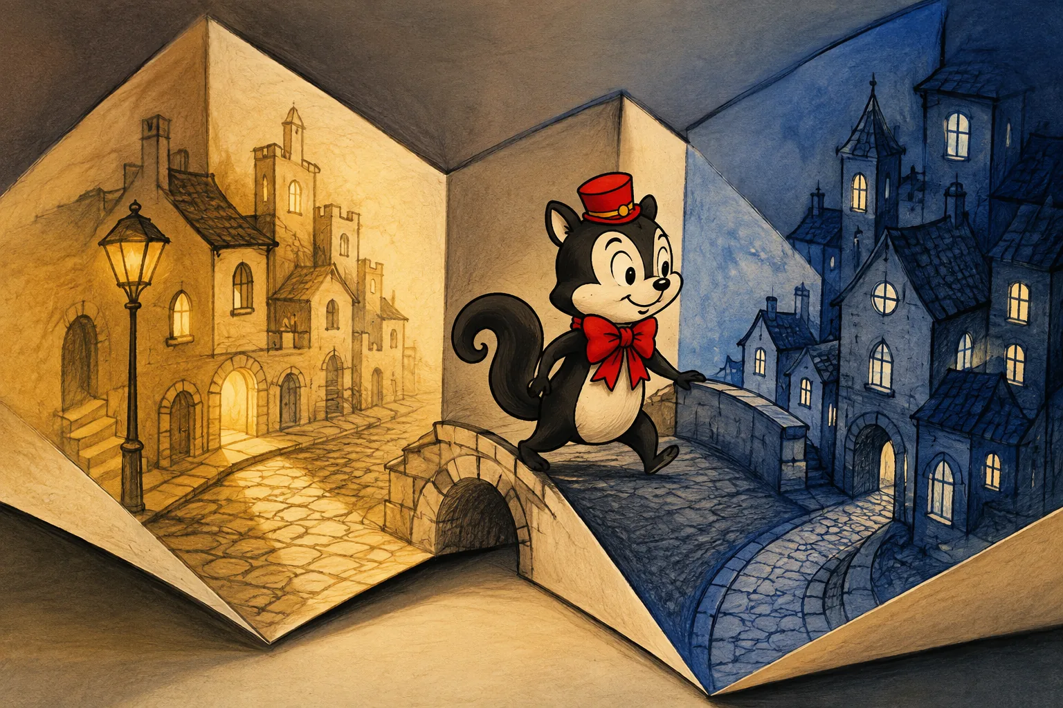
Silent films were often tinted to suggest night, fire, lamplight or a particular mood. Many were photographed in black and white but shown from coloured prints. A blue scene in an old film may therefore preserve a historical presentation choice, rather than a modern attempt to colourise it. [2]
The camera image and the projected image have different histories. Once you separate them, an amber room followed by a blue street becomes easier to read: the film is changing how the scene reaches you, even though its photographic source may be monochrome.
Tinting vs toning: what changes in the picture?
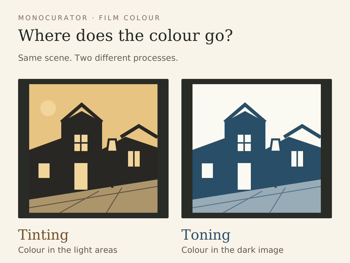
Tinting adds a colour wash; toning changes the dark photographic image. In the dye-bath process described by the U.S. National Archives, the dye binds to the film’s gelatin. It is most visible where the picture would otherwise look light grey or white. The dark image remains dark. [1]
Toning instead uses a chemical change in the silver image to produce coloured compounds. The dark parts become coloured while the light background stays relatively clear. The two processes can also be combined. [1]
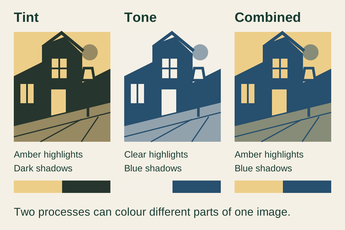
In Seeing Yosemite from a Saddle, the National Archives identifies yellow tinting combined with blue toning. The resulting image has a blue-green appearance. A coloured silent-era image can thus involve more than one process, even when it initially looks like a single wash. [1]
Why are night scenes blue?
Blue was one way to signal night; red could accompany fire, and softer colours could suggest an emotional atmosphere. The NFSA describes these uses while questioning the idea that filmmakers followed a fixed universal system. [2]
Treat colour as a clue that works with the scene. A darkened street, a character carrying a lamp and a change from a warm interior to blue all help establish a transition. The colour does not have to reproduce what an eye would literally see outdoors.
It also changes the feeling of a cut. Compare the two invented frames in the diagram: the buildings keep their arrangement, but attention moves between the luminous sky and the coloured shadows. In a film, that shift happens alongside movement, editing and music. It becomes part of the passage from one place to another.
Does red always mean danger?
No. The San Francisco Silent Film Festival’s programme Fantasia of Color in Early Cinema offers a useful pair of examples. Alfred Machin’s De Molens die juichen en weenen (1912) uses red for its climactic fire. In Buona sera fiori! (1909), red accompanies cheerful animated flowers. The same colour serves very different scenes. [3]
This is why a rigid chart—blue equals night, red equals danger, pink equals romance—quickly becomes less useful than looking at the image around the colour. Ask what has just changed. Has the story moved outdoors? Has something caught fire? Has a playful spectacle begun?
Early colour could also pick out particular objects. Hand-colouring and stencil processes applied colours to areas of individual frames. The festival distinguishes these from tinting and toning, and describes films that combine several methods. A coloured dress against a differently coloured background need not be a modern addition either. [3]
Why do two restored copies have different colours?
Colour was applied to release prints, and the NFSA records variation between copies caused by the dyeing process. Surviving colours can also fade or change hue. Some preservation copies retained the images in black and white while recording the original colours separately. [2]
The nitrate base of early film adds another preservation problem.
A restoration therefore has to interpret surviving evidence. Simply matching what an old strip looks like today may reproduce its fading.
The NFSA’s work on The Bashful Mr Brown makes that problem concrete. The story survived in black and white, but only one frame of the opening title remained. That frame supplied evidence of an orange title. The team extended it into a readable sequence and tested ways to reproduce its colour. [4]
Their report describes a further difficulty: matching the surviving orange did not necessarily recover the colour as it first appeared. Some trial dyes also proved unstable. Recreating the presentation involved the title’s duration, the evidence for its colour and the behaviour of the new material. [4]
That is more revealing than asking which copy looks the brightest. A vivid colour can be attractive without telling you how the restoration reached it.
Is a tinted Nosferatu a good version to watch?
Tinting is a documented feature of the Murnau Foundation’s restoration. Its February 2025 distribution catalogue identifies Nosferatu as tinted, with German intertitles and Hans Erdmann’s music reconstructed by Berndt Heller. [5]
Our Nosferatu version guide compares that restoration with the clues on home-video listings. Use the restoration credit and its account of the source material to understand the colour; the mere presence of a blue wash cannot identify an edition.
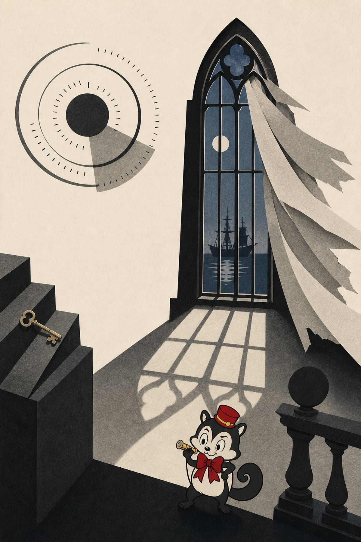
For your next silent film, notice the first change of colour and what happens around it. Then listen to the accompaniment and watch the pace of the movement. Colour, music and speed each help shape the film you are seeing.
Sources
Sources checked on 6 September 2026.
- National Archives: Colorful Chemistry and a Visit to Your National Parks, 16 September 2015.
- Steve Clark, Trevor Carter and Bruce Cowell: Dying light — Part 1: Restoring tinted films, NFSA, 25 October 2012.
- San Francisco Silent Film Festival: Fantasia of Color in Early Cinema, 2016 programme.
- Steve Clark, Trevor Carter and Bruce Cowell: Dying light — Part 2: Tinted film projects, NFSA, 26 October 2012.
- Friedrich-Wilhelm-Murnau-Stiftung: Silent-film DCP catalogue, February 2025, Nosferatu entry.
On screen
Films discussed
- Nosferatu (1922) · F. W. Murnau
Continue exploring on Monocurator
Want a recommendation shaped around your evening? Ask Momo what to watch next →